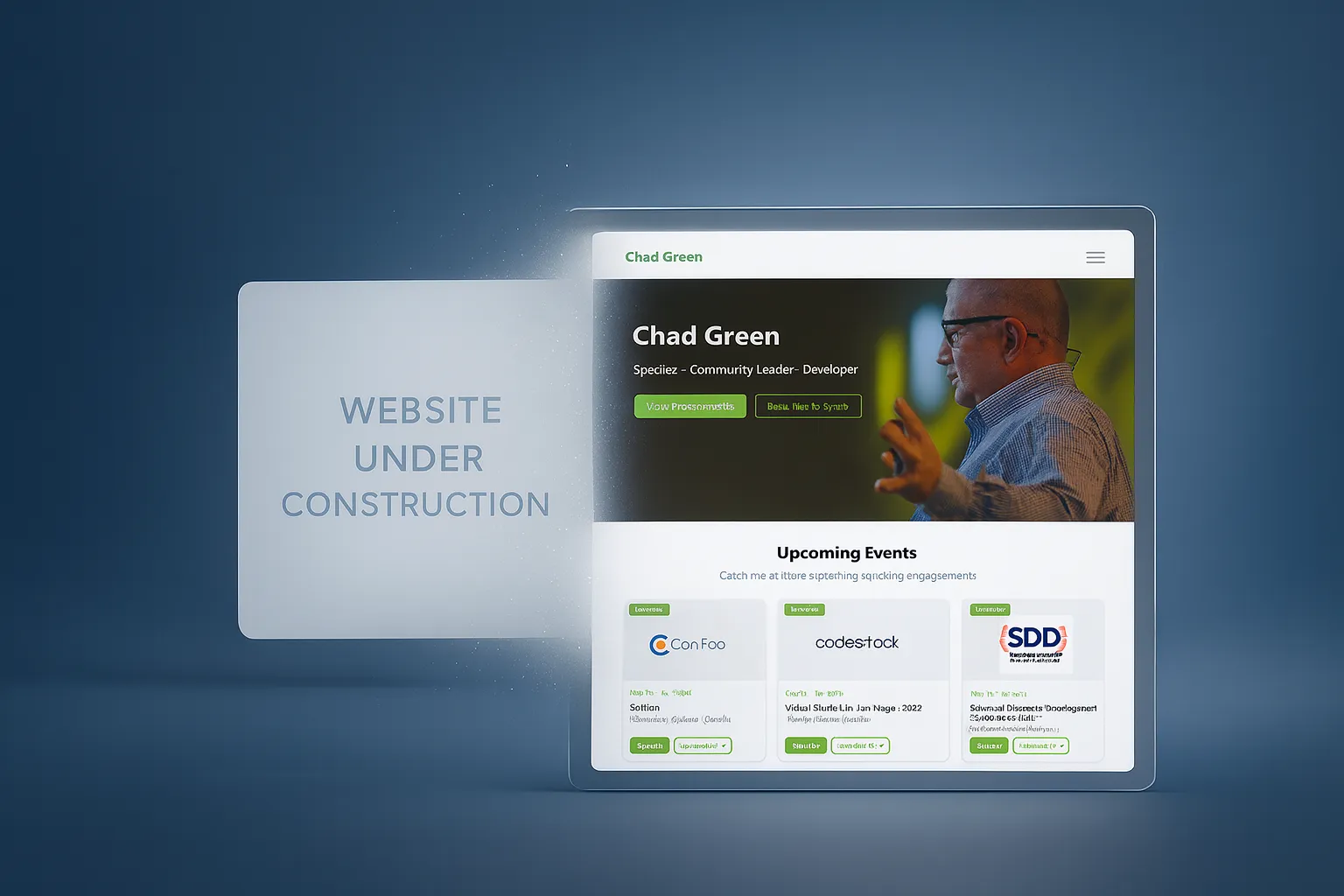
I’m genuinely excited to announce the soft relaunch of chadgreen.com. This is a long time coming, and I’m relieved to finally have something that better expresses the information I want to share.
The biggest highlights:
- The placeholder home page is gone (after over 3 years).
- Speaking and presentation pages are now part of a cohesive site experience.
- The site is usable today for upcoming events, sessions, and resources.
- The build time to MVP was dramatically accelerated using GitHub Copilot.
There is still missing content, and not every workflow is fully tested yet (the contact form is high on my list). But this launch is real progress and a much better way to share what I’m working on than a “coming soon” page.
The Long Road Here (2022 to 2026)
If you have been around for a while, you may remember that I started rebuilding my website back in 2022.
At one point, my homepage literally pointed out that a new site was imminent:
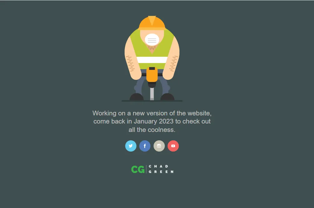
The placeholder home page message that stayed up far longer than planned.
The intent was real; the timeline was not.
Like many long-running personal projects, this one ran into reality: life happened, priorities shifted, and progress moved more slowly than expected.
I did manage to publish the speaking engagement and presentation pages (if you knew the URLs, you could access them). But after that initial push, I did not maintain those pages. The rest of the site remained in flux, and the homepage remained a placeholder signaling “in progress” for far too long.
Why This Took So Long
I had a clear concept for the site and what I wanted it to do, but I struggled to get the visual design to a level I felt good about.
I’m very comfortable architecting and designing robust backends. Front-end designs are a different muscle for me. I can absolutely build practical, business-ready UIs, but creating something that feels truly polished and distinctive takes more effort.
That gap between “works well” and “looks exactly right” is where this project kept slowing down.
The Temporary Repo That Became An Operational Site
While the primary site was in progress, I continued improving how I managed speaking content in GitHub.
For each presentation, I created:
- a private repo for development, working notes, and preparation, and
- a public repo for attendees that contained session details, slides, demos, and related resources.
To streamline the workflow, I built a GitHub Action for each private repo that automatically copies the relevant content to the public repo upon merge to main. This allows me to work privately, annotate my notes and development details, and then automatically push the polished session details (abstract, code samples, slides, etc.) to the public side. I built the original action during downtime at an MVP Summit, one of those productive moments that emerged from conference downtime.
In August 2022, I created my Speaking Engagements repo as a consolidated public listing of where I was speaking. I merged the initial real data on September 3, 2022.
The repo included this note:
This is a temporary listing of Chad Green’s speaking engagements until chadgreen.com is rebuilt.
More than three years later, that “temporary” solution was still the public source of truth.
And honestly, it has been incredibly useful. Not only is it a place for people to see where I will be speaking, but I also rely on it every March when I compile my community contributions for Microsoft MVP renewal.
Multiple Design Starts
My first experience with Figma was as an architect reviewing UI designs that a professional UX designer would build in Figma for my architectural solutions, and I would provide feedback via Figma comments. That was how I first learned how Figma works. Valuable experience, but I was in reviewer mode, not drive mode.
After the initial 2022 rebuild attempt stalled, I returned to Figma myself. I had to figure out how actually to build a design rather than just review one. I created a design that I was much happier with, a visual direction that felt closer to what I wanted for the site. I probably did not build the Figma correctly, and I highly doubt anyone could have taken that design and auto-converted it into working code. But it served its purpose: it was a clear vehicle for visually expressing what I was looking for, even if imperfectly executed.
Later, I worked with a close friend who is an exceptional front-end designer, architect, and developer. Together, we made strong progress on a version of the site that looked amazing. We were close to the finish line, but again, life changed schedules and momentum.
That work still mattered. It clarified the design language and the structure I wanted, even if we did not get to launch that exact implementation.
What Changed One Friday Evening
On a recent Friday evening, I sat down and gave GitHub Copilot a highly detailed prompt. I provided:
- concrete product and content requirements,
- an exported image from the Figma direction,
- and iterative follow-up refinements.
That evening, I had a working site running locally.
From there, I kept iterating: tightening the structure, adjusting the pages, connecting the content, and shaping the current soft-launch state. The result is not perfect, but it is a functional MVP delivered dramatically faster than previous attempts.
Why Copilot Helped So Much
For this project, Copilot reduced the friction in exactly the areas where I was getting stuck:
- translating design intent into real implementation,
- scaffolding repetitive page and content patterns quickly,
- and accelerating iteration cycles so I could evaluate ideas in running code.
In other words, it helped me move from “I know what I want” to ” I can ship this now.”
Current State of the Site
This launch is intentionally practical.
Right now, content for the upcoming 2026 speaking engagements and the associated presentations is available.
Known gaps still being worked:
- older/historical content backfill,
- expended long-form writing,
- and full validation of contact functionality.
So yes, this is a soft launch, but it is absolutely usable, and it gives me a foundation I can now improve in public.
Technology Stack
The site is built on a modern, scalable foundation designed for both developer experience and performance (and, of course, it is serverless):
- Astro: A static site generator that excels at content-driven sites. Astro lets me write components in a variety of frameworks (or just HTML) and generates optimized static HTML by default. This keeps the site fast and simple to deploy.
- Azure Static Web Apps: Provides hosting for the static content directly from the
dist/folder output by Astro. The free tier is perfect for personal projects, and I get a global CDN out of the box. - Azure Functions: The API backend for dynamic workflows. An Azure Function endpoint handles contact form submissions, and the contact API integrates seamlessly with Azure Web Apps’
/apirouting. - TypeScript: Used for type safety in components and scripts, which helped catch issues early while GitHub Copilot was scaffolding new pages.
- Content Collections: Astro’s content collection system provides a structured, type-safe way to manage content (blog posts, presentations, events, meetups). This replaces a traditional database with organized markdown files in source control.
This tech stack keeps things simple, performant, and maintainable. Static generation means the site loads quickly, hosting is inexpensive, and content can live alongside code in GitHub. When I need server-side logic (like email from the contract form), Azure Functions provides that with minimal overhead.
Site Design and Information Architecture
One of the goals of the design was not just visual polish, but also cleaner navigation between related content domains.

Core Sections
- Home (
/): Entry point and high-level highlights. - Presentations (
/presentations): Canonical presentation catalog. - Speaking Engagements (
/speaking): Event-centric view of where sessions are delivered. - Meetups (
/meetups): Meetup groups and individual meetup events. - Blog (
/blog): Articles, updates, and long-form writing. - About (
/about): Personal/professional background. - Contact (
/contact): Reach-out workflow.
How the Sections Work Together
The site is designed so that presentation content and event content are connected without duplicating information:
- A presentation can be viewed in its own canonical context.
- The same presentation can also be discovered through speaking events.
- Meetup content has its own grouping (group → event), but remains consistent with the broader navigation model.
- Blog and informational pages provide context around the work, community, and updates.
This creates multiple discoverability paths for visitors: by topic/presentation, by event, by community activity, or by written content.
What Happens Next
Now that the site is finally live, my focus is straightforward:
- Continue adding and backfilling content.
- Validate and harden code functionality (starting with contact flow).
- Refine design details over time rather than getting stuck on perfection.
This launch matters to me because it breaks the cycle of “almost done.”
It also proves something practical: with strong requirements, iterative feedback, and the right tooling, you can move from stalled redesign to shipping a usable MVP much faster than expected. Yes, using AI agents sped things up, but getting to where I’m at now this fast was more about having those strong requirements and providing iterative feedback.
If you spot issues, missing links, or have suggestions, please reach out.